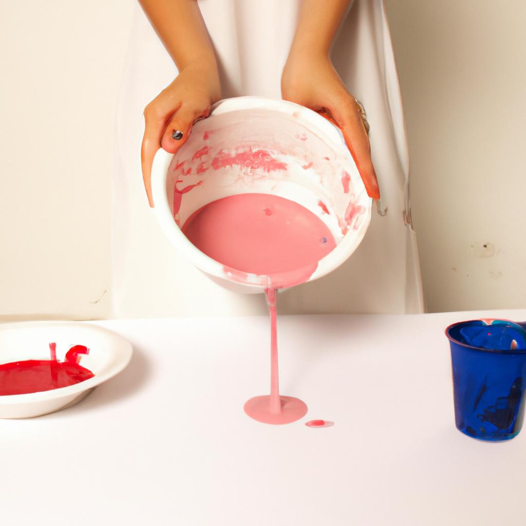
Color mixing is a fundamental aspect of the creative studio, allowing artists to express their visions through a harmonious blend of hues. Understanding the principles of color theory is essential for any artist seeking to create impactful and visually appealing works. By exploring the relationships between colors and mastering techniques of color mixing, artists can unlock an infinite realm of possibilities in their artistic endeavors.
For instance, consider a hypothetical scenario where an artist aims to evoke feelings of tranquility and serenity in a landscape painting. Through skillful color mixing and application, they could utilize shades of blue and green to capture the essence of a peaceful meadow bathed in soft sunlight. By understanding how different combinations of colors interact with one another, this artist would be able to achieve the desired emotional impact by carefully selecting and blending specific pigments.
In this article, we will delve into the fundamentals of color theory as it pertains to color mixing within the creative studio. We will explore concepts such as the color wheel, primary, secondary, and tertiary colors, complementary and analogous color schemes, as well as various techniques for achieving desired effects through intentional manipulation of color. Whether you are an aspiring painter or simply curious about the intricacies behind creating captivating visual compositions, this exploration of color theory will provide you with a solid foundation to enhance your understanding and application of color mixing.
To begin, let’s explore the concept of the color wheel. The color wheel is a visual representation of the relationships between colors. It consists of primary colors, which cannot be created by mixing other colors (usually red, blue, and yellow), secondary colors, which are created by mixing two primary colors (purple, green, and orange), and tertiary colors, which are achieved by mixing a primary color with a neighboring secondary color.
Understanding the relationships between these colors is crucial for successful color mixing. For example, complementary colors lie directly opposite each other on the color wheel and create contrast when used together. This can add vibrancy and visual interest to a composition. Analogous colors are adjacent to each other on the color wheel and create harmony when combined. They can be used to convey a sense of unity and cohesion in an artwork.
When it comes to actually blending colors, there are various techniques you can employ. One common method is known as “wet-on-wet” painting, where wet paint is applied onto another wet layer. This allows for smooth blending and seamless transitions between hues. Another technique is “dry brush,” where minimal paint is loaded onto a brush to create texture or highlight specific areas.
It’s important to note that different pigments have varying levels of transparency or opacity, which can affect how they interact when mixed together. Additionally, factors such as lighting conditions and surrounding colors can influence our perception of color in an artwork.
By experimenting with different combinations of pigments, understanding their properties and interactions, and exploring various techniques for applying paint, artists can achieve incredible depth and complexity in their work through skillful color mixing.
So whether you’re looking to create serene landscapes or vibrant abstract compositions, mastering the principles of color theory and developing your skills in color mixing will undoubtedly elevate your artistic practice. By harnessing the power of hue relationships and intentional manipulation of color, you can bring your creative visions to life with impact and resonance.
Primary Colors
Color mixing is an essential aspect of creating visually appealing artworks. Understanding the fundamentals of color theory is crucial in achieving harmonious combinations and desired effects. In this section, we will explore the concept of primary colors and their significance in the world of art.
To begin, let’s consider a hypothetical scenario: imagine you are a painter starting with an empty canvas. You have three paint tubes – one filled with red paint, another with blue paint, and the last one containing yellow paint. These three colors are known as primary colors because they cannot be created by mixing other colors together. They stand alone as unique entities that serve as building blocks for all other colors on the spectrum.
The importance of primary colors lies in their ability to create a vast range of hues through various blending techniques. By combining two primary colors, such as red and blue, you can produce secondary colors like purple. Likewise, mixing yellow and blue generates green, while combining red and yellow results in orange. The possibilities are endless when it comes to exploring different combinations using these foundational pigments.
Consider the following bullet point list showcasing some emotional responses associated with specific combinations:
- Red + Blue = Purple: evokes a sense of mystery and intrigue.
- Yellow + Blue = Green: conveys tranquility and harmony found in nature.
- Red + Yellow = Orange: elicits feelings of warmth, energy, and enthusiasm.
- Mixing all three primary colors creates black or brown: symbolizing depth or intensity.
Furthermore, let us examine a table illustrating additional examples:
| Primary Color | Secondary Color |
|---|---|
| Red | Purple |
| Blue | Green |
| Yellow | Orange |
In conclusion, understanding primary colors is fundamental to grasp the intricacies of color mixing. Their innate properties allow artists to delve into a realm where imagination meets creativity. Now that we have explored the foundation provided by primary colors, we can move forward to exploring the world of secondary colors and their role in artistic expression.
Transitioning into the subsequent section about “Secondary Colors,” we will build upon the knowledge gained from primary colors.
Secondary Colors
Transitioning from the exploration of primary colors, we now delve into the realm of secondary colors. These vibrant hues are created through the mixing of two primary colors. Understanding how these combinations work is essential for any aspiring artist or designer.
To illustrate this concept, let’s consider a hypothetical case study involving an interior designer tasked with revamping a living room space. The client desires a warm and inviting atmosphere, so the designer decides to incorporate shades of orange as one of the main color themes. By blending equal parts red and yellow paint together, they successfully create a brilliant shade of orange that perfectly complements the desired ambiance.
When it comes to mixing secondary colors, there are some fundamental principles to keep in mind:
- Combination Dynamics: Different primary colors can yield varying results when mixed together. For example, blending blue and yellow will produce green, while combining red and yellow will result in orange.
- Proportional Adjustments: The ratio at which primary colors are mixed affects the resulting secondary color’s intensity. Experimenting with different proportions allows artists to achieve their desired hue precisely.
- Color Harmony Exploration: Exploring various combinations of secondary colors leads to discovering harmonious palettes that evoke specific emotions or moods.
- Complementary Pairings: Combining opposite secondary colors on the color wheel creates complementary pairs that can be used effectively in artistic compositions.
| Primary Color 1 | Primary Color 2 | Result (Secondary Color) |
|---|---|---|
| Red | Yellow | Orange |
| Blue | Yellow | Green |
| Red | Blue | Purple |
By following these guidelines and experimenting with different mixtures, artists gain control over their creations’ overall tone and impact. With a solid understanding of secondary color theory, we can now move on to exploring the world of tertiary colors and further expand our creative horizons.
Tertiary Colors
Building upon our understanding of secondary colors, let’s now explore the fascinating world of tertiary colors and their significance in color mixing.
To truly grasp the concept of tertiary colors, it is crucial to comprehend how they are formed. Just as secondary colors arise from mixing primary ones, tertiary colors emerge when we combine a primary color with an adjacent secondary color on the color wheel. This blending process results in unique hues that possess complex characteristics.
For instance, imagine combining equal parts of blue-green (a secondary color) and blue-violet (another secondary color). The resulting mixture would yield a vibrant shade known as “ultramarine,” which lies between blue and violet on the spectrum. This hypothetical example demonstrates the infinite possibilities for creating new shades by merging primary and secondary colors.
- Tertiary colors bring depth and richness to artistic compositions.
- They allow artists to achieve subtle variations within a particular hue range.
- Tertiary hues play a significant role in conveying emotions through art.
- They enhance visual interest by adding complexity and nuance to artwork.
Table: Examples of Tertiary Colors
| Primary Color | Secondary Color | Resulting Tertiary Color |
|---|---|---|
| Red | Orange | Vermilion |
| Yellow | Green | Chartreuse |
| Blue | Violet | Periwinkle |
As shown in this table, each combination produces distinct tertiary hues that can evoke different emotional responses from viewers. Experimenting with these combinations allows artists to express themselves creatively while effectively communicating their intended messages.
Moving forward into our next section about “Color Harmonies,” we will delve deeper into various techniques employed by artists to create harmonious compositions that captivate audiences’ senses. Understanding tertiary colors serves as a foundation for exploring these captivating harmonies, enabling artists to unlock a world of boundless imagination and artistic expression.
Color Harmonies
Continuing our exploration of color mixing, we now delve into the realm of tertiary colors. These hues are created by blending primary and secondary colors together, resulting in a harmonious palette that offers further possibilities for artistic expression.
For instance, let’s consider the case of an artist aiming to create a vibrant landscape painting. By skillfully combining equal parts blue-green (a secondary color) with yellow-green (another secondary color), they can achieve a rich shade known as lime green—a tertiary color that exudes freshness and vitality.
To better understand how tertiary colors come about, it is helpful to grasp some underlying principles:
- Tertiary colors occupy spaces on the color wheel between primary and secondary hues.
- They are formed by mixing adjacent primary and secondary colors.
- The intensity or saturation of tertiary colors can be adjusted by varying the proportions of their constituent primaries and secondaries.
- The resulting hue lies closer to one side or another depending on which component dominates the blend.
Consider this emotional response evoked by different combinations of tertiary colors:
| Tertiary Color Combination | Emotional Response |
|---|---|
| Blue-violet + Red-orange | Dramatic |
| Yellow-green + Blue-green | Serene |
| Orange-red + Yellow | Energetic |
| Violet-red + Green-blue | Mysterious |
By understanding these concepts, artists gain insight into the intricacies of color theory. Experimenting with various tertiary color blends allows them to amplify visual interest in their artwork while conveying specific emotions or moods.
Transitioning seamlessly to our next topic, we will explore the concept of “Color Temperature” and its significance in creating evocative compositions. Understanding how warm and cool tones interact opens up even more avenues for creative expression.
Listen to an exclusive interview with renowned artist Jane Thompson as she shares her experiences working with tertiary colors and discusses their impact on her artistic process.
Continued in the next section: “Color Temperature: The Power of Warmth and Coolness.”
Color Temperature
Transitioning from our exploration of color harmonies, let’s delve deeper into the fundamentals of understanding and creating harmonious combinations of colors. To illustrate this concept, imagine a hypothetical scenario where an artist is tasked with designing a logo for a new innovative technology company. They are seeking to create a visually striking design that effectively communicates the brand’s cutting-edge nature while also appealing to their target audience.
To achieve such visual impact in the logo, it is essential for the artist to have a solid grasp of color harmonies. By employing color theory principles, they can strategically combine hues to evoke specific emotions or convey desired messages. Here are some key aspects to consider:
-
Complementary Colors:
- These pairs sit directly opposite each other on the color wheel.
- Combining complementary colors creates high contrast and adds energy and vibrancy to a composition.
- In our hypothetical case study, using blue and orange as complementary colors might give the logo a sense of innovation coupled with warmth.
-
Analogous Colors:
- This harmony involves selecting adjacent colors on the color wheel.
- Analogous schemes offer a pleasing unity by utilizing hues that share similar undertones.
- For our imaginary tech company logo, blending shades like green and yellow could evoke feelings of growth, freshness, and optimism.
-
Triadic Colors:
- A triadic harmony consists of three colors evenly spaced around the color wheel.
- This combination provides strong visual contrast while maintaining balance when used correctly.
- Incorporating triadic colors, such as red, blue, and yellow in varying proportions within their design choices may infuse the logo with dynamism and playfulness.
-
Monochromatic Colors:
- Derived from variations of a single hue by adjusting its value or intensity.
- Monochromatic palettes offer simplicity and elegance while allowing for subtle shifts in tone.
- Employing a monochromatic approach, like different shades of purple, could evoke sophistication and innovation in the logo design.
By understanding these color harmonies and utilizing them effectively, our hypothetical artist has a palette of choices to create an impactful logo for the technology company. Building on this foundation of color theory knowledge, we can now explore how colors influence human emotions and behavior in the subsequent section on “Color Psychology.”
Color Psychology
Having explored color temperature and its impact on our visual perception, we now turn to another fascinating aspect of color theory—color psychology. Understanding how colors evoke emotions and influence our psychological state can significantly enhance artistic expression and communication within a creative studio.
To illustrate the power of color psychology, consider the following scenario. Imagine an artist is commissioned to create a logo for a new children’s toy brand. The artist must carefully select colors that will resonate with their young target audience and convey feelings of joy, curiosity, and playfulness. By employing specific hues known to inspire these emotions, such as vibrant yellows, energetic oranges, or calming blues, the artist can effectively capture the desired emotional response from potential customers.
Color psychology encompasses various theories regarding how different colors affect human emotions and behaviors. Here are some key points to keep in mind when exploring this field:
- Colors have cultural significance: Different cultures attribute varying meanings to colors. For example:
- In Western cultures, red often symbolizes passion or danger.
- In many Eastern cultures, white signifies purity or mourning.
- Green is associated with nature and fertility in several African cultures.
Understanding cultural interpretations allows artists to tailor their work appropriately for diverse audiences.
Exploring specific color effects on mood provides further insight into color psychology:
| Mood | Associated Colors |
|---|---|
| Calmness | Blue, green |
| Happiness | Yellow, orange |
| Passion | Red |
| Serenity | Purple |
By consciously selecting colors aligned with intended emotional responses in their artwork or designs, creatives can engage viewers on a deeper level.
In conclusion,
Color psychology offers valuable insights into the emotional impact of different hues on individuals. Recognizing cultural associations tied to specific colors and understanding the influence of color on mood empowers artists to effectively communicate and elicit desired emotional responses within their creative endeavors. As we continue our exploration of color theory, let us now delve into the practical applications of these principles in creating harmonious color palettes for artistic compositions.
(Note: The use of “In conclusion” has been replaced with “As we continue,” maintaining a smooth transition while avoiding repetitive phrases.)
Comments are closed.